Return to GeoComputation 99 Index
Peter L. Guth
Department of Oceanography, U.S. Naval Academy, Annapolis MD 21402-5026.
Email: pguth@nadn.navy.mil
Digital elevation models (DEMs) yield a terrain classification based on three variables: elevation, ruggedness, and topographic fabric or grain (tendency to form linear ridges). To quantify fabric, the analysis extracts eigenvectors and eigenvalues from a 3 by 3 matrix of the sums of the cross products of the directional cosines of the surface normals at each point in the DEM. For topography eigenvalue S1 is much greater than S2, and S2 is approximately equal to S3; eigenvector S1 is approximately vertical, and orthogonal eigenvectors S2 and S3 are horizontal. The ratios ln(S1/S2) and ln(S1/S3) correlate highly with relief (difference between highest and lowest elevations), standard deviation of elevation, average slope, and standard deviation of slope; any of these could categorize ruggedness. Uncorrelated with ruggedness, ratios (ln(S1/ S2)/ln(S2/ S3)) and ln(S2/ S3) measure the fabric or grain. Orientations of S2 and S3 define the dominant grain of the topography, and the ratio of S2 to S3 determines the strength of the grain. Average elevation correlates poorly with all other measures, defining the third element of the classification.
This fabric measures a point property of the DEM and the underlying topographic surface, but the property depends on the size of the region considered. This property varies in a systematic way, both spatially over a region and at a single point as the region size varies. With 30-m DEMs, regions as small as 100 elevations (300-m squares) produce meaningful results. The analysis appears relatively insensitive to DEM quality (U.S. Geological Survey Level 1 and Level 2 DEMs produce very similar results) or DEM spacing (10-m and 30-m DEMs also produce similar results).
Visualizing this organization of topography requires a variety of graphical techniques, including contoured stereographic projections of surface normals, graphs showing the variation in ruggedness and fabric strength as a function of analysis region size, colored maps showing the strength and orientation of the fabric, and contour or reflectance maps with the direction and strength of the fabric overlaid by vectors. Animations showing how these parameters vary with region size greatly assist in the analysis process.
Digital elevation models (DEMs) provide a representation of the earth's surface, useful for a wide range of fields. In addition to the utility of the raw elevation data, derived data like slope, aspect, and computed reflectance greatly enhance the value of DEMs. DEMs exist over a wide range of spatial scales, from the small scale global coverage to large scale local coverage. They can be used as background displays for other data, manipulated for three dimensional effects, and used for computations.
Pike (1988) listed a dozen groups of parameters used as terrain descriptors, about half dealing with spatial (x,y) characters and half with vertical (z) parameters, and focused on five descriptive categories: altitude, slope between topographic reversals, slope at constant slope length, slope curvature, and the power spectrum. He used manually digitized data at 30 m resolution, and a resulting "geometric signature" to categorize terrain characteristics and suggest the degree of danger from landslides. Since his work an increasing number of high quality DEMs have appeared to make geomorphometry increasingly accurate and automated. Table 1 shows the free DEMs currently available on the WWW. With the exception of the global 5 minute data sets, the fabric method discussed here has been successful with all of these data sets.
Table 1. Free DEMs currently available on the World Wide Web
DEM and producer |
Data Spacing |
Coverage |
ETOPO5 |
5 arc minutes |
World wide, includes bathymetry |
TERRAIN BASE (NGDC) |
5 arc minutes |
World wide, includes bathymetry |
GTOPO30 (USGS led team) |
30 arc seconds |
World wide |
DTED 0 (NIMA) |
30 arc seconds |
~50% land surface |
GLOBE (NGDC, not yet available) |
30 arc seconds |
World wide, includes bathymetry |
1:250,000 DEM (USGS release of older NIMA Data) |
3 arc seconds |
Entire US |
1:24,000 DEM (USGS) |
30 m UTM projection |
Most of US |
1:24,000 DEM (USGS) |
10 m UTM projection |
Limited areas of US |
Pike et al. (1989) documented the definition of the term "grain" in the literature. An intuitive definition of topographic grain, for the strength and orientation of valleys and ridges, corresponds with the grain of wood and other natural materials. Pike et al. (1989) focused on the characteristic horizontal spacing of major ridges and valleys as topographic grain, which would only be part of a broader definition of grain. I will use the term "fabric" to refer to the orientation in space of the elements making up the landscape, in line with the usage of the term in structural geology and petrology. This concept of terrain fabric includes strength, ranging from highly organized to random, and a direction corresponding to the preferred orientation of the ridges and valley.
Investigations of the spatial patterns of terrain have used the variogram (e.g. Vergne and Souriau, 1993) or the power spectrum (e.g. Pike and Rozema, 1975) to determine the strength and spacing of landforms. Pattern recognition with DEMs uses many techniques associated with image analysis, and has focused primarily on lineament extraction (e.g. Raghavan et al., 1993; Koike et al., 1998). Numerous investigators (e.g. Gardner et al., 1990) have investigated the extraction of geomorphometric parameters relating to drainage patterns and basins from DEMs.
This paper will present an eigenvector routine to determine the strength and orientation of topographic fabric. Topographic fabric has the potential for terrain classification on scales from the global to the local, and as a point descriptor of terrain suitable for terrain analysis and ultimately for cross-country mobility studies. Because of the unique capabilities of HTML publication, this paper will concentrate on examples using color graphics and animations.
2. Algorithm
Chapman (1952) proposed a quantitative technique of topographic analysis, contouring normal vectors to the earth's surface using standard structural geology procedures. He manually computed slope and aspect (downhill direction) from topographic maps, plotted, and contoured the diagrams by hand. Chapman (1952) called this a statistical slope orientation, or SSO, diagram. Guth (1995) computerized the process using a DEM. The slope and aspect define a vector normal to the earth's surface, plotted onto the lower hemisphere of an equal-area projection (also called a Lambert projection or Schmidt net). Contouring the resulting density distribution creates a visual representation of the terrain fabric. Computer contouring can be done computationally, or by the traditional graphical technique of passing a small circle over the plot and counting the number of points plotted within the circle, which can be done very efficiently on the computer (Guth, 1987). Densities are expressed in terms of the percentage of points within a 1% area on the plot. Because of the lower hemisphere projection used, the points plotted can best be interpreted as pointing in the uphill direction. On the contoured diagrams, points will appear with steeper slopes than actually occur. The steepest points will actually lie one diameter of the 1% counting circle closer to the center of the diagram than they appear on the diagram.
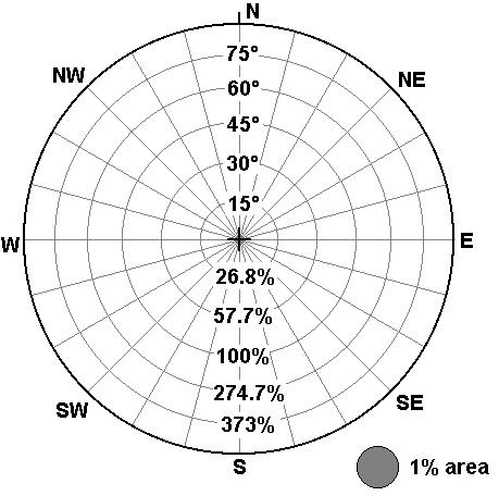
Fig. 1. Lower hemisphere equal area projection, show ing slopes in both degrees and percent slope (100 * tangent of slope angle) in the concentric circles, and uphill direction in the radial lines.
Woodcock (1977) discussed an eigenvalue method for the representation of fabric shapes in structural geology, paleomagnetism, sedimentology, and glaciology. This method will be applied here to DEMs to quantify Chapman's (1952) technique. The normals to the earth's surface can be viewed as a cloud of vectors in space, and the three eigenvectors will define the three dimensional ellipsoid that best models their distribution. The relative magnitudes of the three eigenvectors, and their orientation, define the distribution.
This method requires definition of a region of interest. All results reported here use a rectangular region. Some analyses use a defined geographic block, such as the 1° tiles of DTED level 0 or the 7.5' size of the USGS 1:24,000 DEM, or a subdivision thereof. In this case the analysis applies to a region, which in most cases will be rectangular in shape because of the geometry of latitude/longitude lines. Other analyses use a selected point, define the size of the region, and center the region about the point. In this case the analysis represents a point property, and the selected region size will be a square. Adjacent points will have similar but distinct values, because the boundaries of the region will change as the central point shifts. While there might be some theoretical value in using circular rather than square regions, the additional programming effort does not appear to be justified.
This analysis has concentrated on the following data sets:
†For NIMA, "level" refers to ground resolution, and larger numbers are better. For USGS, "Level" refers to data quality and larger numbers are higher quality.
3. Graphics in This Paper
This paper employs a large number of graphic animations which can tax the capabilities of some computers and especially downloads over the WWW. There about 60 graphics files, with a total size of about 12 Mb. To keep loading times to a minimum, this page employs only thumbnail graphics linking to the full sized graphics located on additional pages. Some of those pages contain multiple graphics, not all represented on the thumbnails. If at all possible you should set your display resolution to at least 1024 pixels wide so that the full animations will appear on screen. Unless explicitly noted, the animations on a page are not synchronized. To slow down the animations for detailed study, you must view the animated GIF files in a viewer that allows you to manipulate the refresh rate. The MICRODEM freeware program used to create the animations has the ability to replay them with control over the refresh rate.
4. Terrain Classification Categories
Principal components analysis, using data sets at both 30 m and 30" data spacing, tested the relationship of the flatness and organization measures derived from the eigenvector analysis to other commonly used geomorphometric parameters calculated from the DEMs. Table 2 shows the results with DTED Level 0. Three clusters appeared:
Table 2. Correlation Matrix for Terrain Parameters from DTED Level 1, 1/3° cells
|
Relief |
Avg Elev |
Std elev |
Avg slope |
Std Slope |
ln(s1/s2) |
ln(s2/s3) |
Shape |
Strength |
|
|
Relief |
1.000 |
0.618 |
0.971 |
0.886 |
0.902 |
-0.792 |
-0.065 |
-0.142 |
-0.784 |
|
Avg Elev |
1.000 |
0.591 |
0.550 |
0.529 |
-0.485 |
-0.048 |
-0.087 |
-0.481 |
|
|
Std elev |
1.000 |
0.890 |
0.905 |
-0.775 |
-0.057 |
-0.141 |
-0.766 |
||
|
Avg Slope |
1.000 |
0.939 |
-0.802 |
-0.125 |
-0.126 |
-0.801 |
|||
|
Std Slope |
1.000 |
-0.850 |
-0.090 |
-0.144 |
-0.844 |
||||
|
Ln(S1/S2) |
1.000 |
0.095 |
0.174 |
0.991 |
|||||
|
Ln(S2/S3) |
1.000 |
-0.363 |
0.225 |
||||||
|
Shape |
1.000 |
0.122 |
|||||||
|
Strength |
1.000 |
Because the strength and shape factors (Fisher and others, 1987) appear to duplicate the flatness and organization parameters, they will not be considered further here.
5. SSO Diagrams
Figures 2 and 3 show SSO diagrams (Chapman, 1952) for a location in the folded Appalachian Mountains and two spots in the Grand Canyon. The animated diagrams show the effect of increasing the size of the region considered in making the diagram: points cover a larger portion of the diagram, and the maximum concentrations become less well defined.
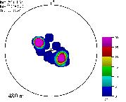
Fig. 2. SSO diagram animation for Aughwick, PA quadrangle. 272 kb
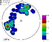
Fig. 3. SSO diagram animations for Bright Angel Point, Arizona, quadrangle. 700 kb
6. Flatness vs. Organization Graphs
Woodcock (1977) presented graphs of ln(S1/S2 ) ("flatness") and ln(S2/S3) ("organization") to show the variations in fabric. Figure 4 shows how these vary with the size of the region considered, and for different geographic locations. As the region size increases, fewer extreme values occur as the terrain becomes more average. These graphs clearly show strongly organized terrain like the Appalachians of Pennsylvania, which appear much different than California.
Fig.4. Graph of flatness vs organization. 164 kb
High organization values often appear in regions of low relief. If these regions have a general regional slope, its strike direction (in the geologic meaning, for the direction of a horizontal line) will appear as a fabric direction. High organization values represent a more important directional fabric as the steepness increases.
7. Classification Maps
The classification maps shown in the section break the DEM in rectangular blocks and compute topographic characteristics in each block. Each parameter can be color coded and displayed on a single map, and two or three parameters can be merged as separate colors with an RGB color model.
Figure 5 shows 10 maps of the Tethyan region. These maps use global DEMs with 30" data spacing; this small region was chosen to show the level of detail possible from such data sets if the analysis units are set at 1/3° . The five steepness measures all highlight the major topographic features of the region: the Zagros Mountains in Iran, the ranges in Pakistan and Afghanistan, the Himalayas, and farther north the Tien Shan and Tarim Basin. All the maps of steepness features show essentially the same information, since as shown in Table 2 these measures all correlate very strongly. The organization map, and maps overlaying the topographic fabric, clearly show that fabric need not correlate with steepness. The Himalayas show poor organization despite their extreme ruggedness; they erode essentially isotropically.
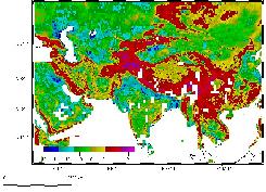
Fig. 5. DTED classification of Tethys 1.4 Mb
Figure 6 shows 5 maps of Pennsylvania, computed from subsets of the 1:24,000 USGS DEM with an analysis region approximately 1' in size. Terrain fabric computed from the eigenvector method clearly corresponds with the folded Appalachian Mountains.
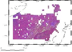
Fig. 6. Classification of Pennsylvania 840 kb
Figure 7 shows two classifications of the world using the GTOPO30 data set and 1° regions. Note that the continental glaciers in Greenland and Antarctica show color patterns unlike any other regions on earth; this could reflect both characteristics of the data and the actual topographic surface.
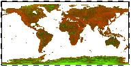
Fig. 7. Global classification maps 74 kb
8. Variation of Parameters with Region Size
In addition to breaking the DEM into regions, computing statistics, and displaying maps as was done in the previous section, these parameters can be viewed as point properties of a specified region surrounding each point in the DEM. Parameters will vary with the size of the region considered, as was previously shown with Figures 2, 3, and 4. Those depictions did not show the spatial variation of the features, or how the spatial patterns vary with the choice of region size. Figure 8 shows how the flatness, organization, and direction parameters vary with region size for part of the Grand Canyon.
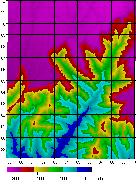
Fig. 8. Animated maps for the Bright Angel Point, Arizona, quadrangle. 2 Mb
9. Fabric Overlays and DEM Quality and Spacing
Overlaying the fabric with vectors proportional to organization, and with the correct orientation, on a map display provides one of the most effective way to visualize the eigenvector analysis. In addition to showing the fabric, this procedure allows comparison for multiple DEMs covering the same area. This section looks at USGS 1:24,000 DEMs, and the effect of DEM quality (Level 1 versus Level 2), and of data spacing (10 m versus 30 m).
Table 3 lists the key statistics for the USGS 1:24,000 DEMs selected for the detailed analyses in this paper. These were all selected from the sample of 250 paired Level 1 and Level 2 DEMs, which will be considered in more detail in the next section. For all DEM pairs except for the 10 m DEM the fabric orientations agree within less than 2°. These three quadrangles represent a range of values for organization; Aughwick has the most organized fabric in the entire sample of 250 (the four next most highly quadrangles were also in Pennsylvania), Bright Angel Point has a moderate fabric orientation, and Montara Mountain has effectively no preferred orientation. The flatness values from each pair agree very closely.
Table 3. USGS DEMs figured in analyses in this paper
|
1:24,000 Quadrangle |
Level 1 DEM |
Level 2 DEM |
||||
|
ln(s1/s2) |
ln(s2/s3) |
Fabric |
ln(s1/s2) |
ln(s2/s3) |
Fabric |
|
|
Aughwick PA |
2.64 |
1.49 |
36.4° |
2.70 |
1.63 |
35.6° |
|
Bright Angel Point, AZ |
1.52 |
0.28 |
2.0° |
1.27 |
0.30 |
1.6° |
|
Montara Mountain, CA 30 m |
2.39 |
0.20 |
142.3° |
2.40 |
0.15 |
140.7° |
|
Montara Mountain, CA 10 m |
2.43 |
0.07 |
144.9° |
|||
Figure 9 shows three independent DEMs of the Montara Mountain, California quadrangle. Visual inspection of the results shows that the fabric patterns for these three DEMs show the same trends. This does not mean that the Level 2 DEMs do not generally represent a major improvement over the Level 1 DEMs (but see Guth, in press, for an example of an undesired artifact in the Level 2 DEMs), or that 10 m data does not improve capabilities for many display and computations operations, but that this eigenvector method is relatively insensitive to the DEM creation process and data resolution.
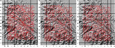
Fig. 9. Fabric overlays for the Montara Mountain, California, quadrangle, using three different DEMs. 1.9 Mb
Figure 10 shows graphs of the key fabric parameters at four points in the Montara Mountain quadrangle, showing how they vary with region size and for three independent DEMs. The three DEMs show generally the same trends.
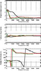
Fig. 10. Graphs of Fabric Measures at a Single Point 533 kb
Figure 11 shows the fabric measures for a three independent DEMs superimposed on the same map, animated to show the effect of varying the region size. This is an enlargement of Figure 9 that includes more data points. The fabric computations generally agree, with the largest differences in regions of weak fabric where the orientation can vary substantially. Examples from two other maps show that these results are typical of the three DEM series considered.
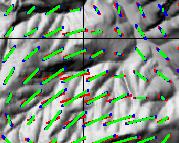
Fig. 11. Fabric overlays on the same base map. 2.6 Mb
Figure 12 shows the results of this analysis using independent Level 1 and Level 2 DEMs of the Aughwick, Pennsylvania Quadrangle. Ridge crests have different characteristics than the slopes or the valley bottoms. The crests show a consistent, strong fabric, whereas the slopes show a shift in the pattern. For small regions on the slopes, the dominant direction runs down the slope, measuring the small drainages and the ridges between them, oriented perpendicular to the dominant regional trend. Beyond a region size of about 1000 m, all points share a common orientation for the fabric.
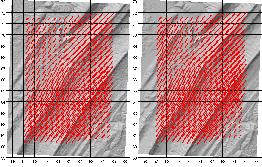
Fig. 12. Fabric overlays for the Aughwick, Pennsylvania , quadrangle, using two independent DEMs. 1.1 Mb
These two DEMs shown in Figures 9 to 12 reveal greatly different fabric patterns. The overall fabric in the Aughwick quadrangle is strong and uniformly directed to the NE; in the Montara Mountain quadrangle, the fabric varies by subregion, and overall there is little preferred orientation.
10. Level 1 and Level 2 USGS DEMs
In addition to the qualitative assessment of fabric similarity from independent DEMs in the last section, a statistical analysis of the 250 paired DEMs with both Level 1 and Level 2 coverage offers insight into the robustness of the eigenvector analysis. Level 1 data come from the National High-Altitude Photography Program, equivalent photography, or Gestalt Photo Mapper manual profiling. Interpolation from digital contours produces Level 2 data. Garbrecht and Starks (1995) noted 90 m striping in low relief (15 m vertical over 10 km horizontal distances) DEMs in Nebraska, attributed to the manual profiling from photogrammetric models used for some Level 1 USGS DEMs. This affect is most obvious on reflectance images in map view or draped on the terrain.
Flatness correlates almost perfectly between the independent DEMs, suggesting that all USGS DEMs record this aspect of terrain. Organization and the dominant direction correlate well, but show some scatter. This appears to reflect two distinct processes: (1) the method works less well in low relief regions, and (2) some, but by no means all, Level 1 DEMs show significant artifacts from the digitization process.
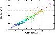
Fig. 13. Comparison of Level 1 and Level 2 USGS DEMs 145 kb
11. Conclusions and Further Research
Conclusions:
Directions for further research include:
References
Baltuck, M., 1997, Solid earth programs meet Coolfont goals: EOS, vol.78, no.47, p.537, 540.
Chapman, C.A., 1952, A new quantitative method of topographic analysis: American Journal of Science, vol.250, pp.428-452.
Fisher, N.I., Lewis, T., and Embleton, B.J.J., 1987, Statistical analysis of spherical data: Cambridge University Press, 329 p.
Freedman, A.P., Hensley, S., and Chapin, E., 1998, GeoSAR: A system for obtaining high-resolution, true ground surface, digital elevation models at regional scales: EOS, vol.79, no.17, p.S5.
Gardner, T.W., Sasowsky, K.C., and Day, R.L., 1990, Automated extraction of geomorphometric properties from digital elevation models: Zeitschrift fur Geomorphologie N.F. Supplementband 80, pp.57-68.
Guth, P.L., 1987, MicroNET: interactive equal-area and equal-angle nets: Computers & Geosciences, vol.13, no.5, p.541-543.
Guth, P.L., 1995, Slope and aspect calculations on gridded digital elevation models: Examples from a geomorphometric toolbox for personal computers: Zeitschrift fur Geomorphologie N.F. Supplementband 101, pp.31-52.
Guth, P.L., 1999, Quantifying topographic fabric: Eigenvector analysis using digital elevation models: in Proceedings 27th Applied Imagery Pattern Recognition (AIPR) Workshop, sponsored by the SPIE (The International Society for Optical Engineering), vol.3584.
Guth, P.L., 1999 (in press). Contour line "ghosts" in USGS Level 2 DEMs: Photogrammetric Engineering & Remote Sensing, vol.65.
Guzzetti, F., and Reichenbach, P., 1994, Towards a definition of topographic divisions for Italy: Geomorphology, vol.11, p.57-74.
Koike, K., Nagano, S., and Kawaba, K., 1998, Construction and analysis of interpreted fracture planes through combination of satellite-image derived lineaments and digital terrain elevation data: Computers & Geosciences, vol.24, no.6, p.573-584.
Pike, R.J., 1988, The geometric signature: Quantifying landslide-terrain types from digital elevation models: Mathematical Geology, vol.20, no.5, p.491-512.
Pike, R.J., Acevedo, W., and Card, D.H., 1989, Topographic grain automated from digital elevation models: Proceedings 9th International Symposium on Computer Assisted Cartography, Baltimore, April 2-7, 1989, ASPRS/ACSM, p.128-137.
Pike, R.J., and Rozema, W.J., 1975, Spectral analysis of landforms: Annals of the Association of American Geographers, vol.65, no.4, p.449-516.
Pike, R.J., and Thelin, G.P., 1989, Cartographic analysis of U.S. topography from digital data: Proceedings International Symposium on Computer Assisted Cartography, Auto-Carto 9, ASPRS/ACSM, p.631-640.
Press, W.H., Flannery, B.P., Teukolsky, S.A., and Vetterling, W.T., 1986, Numerical Recipes: the Art of Scientific Computing: Cambridge University Press, 818 p.
Raghavan, V., Wadatsumi, K., and Masumoto, S., 1993, Automatic extraction of lineament information of satellite images using digital elevation data: Nonrenewable Resources, vol.2, no.2, p.148-155.
Vergne, M., and Souriau, M., 1993, Quantifying the transition between tectonic trend and meso-scale texture in topographic data: Geophysical Research Letters, vol.20, p.2139-2141.
Woodcock, N.H., 1977, Specification of fabric shapes using an eigenvalue method: Geological Society of America Bulletin, v.88, p.1231-1236.