GEOG5870/1M: Web-based GIS A course on web-based mapping
Google Maps: An Introduction
Before we get started, the first thing to know is that Google Maps is continually updating. While this course covers the fundamentals of creating your own Web-based GIS, its virtually impossible to teach you everything that Google is up to. The following website is worth periodically checking out to see what they are playing around with: Google Play.Google Maps:
History and features
We start with a brief history of the introduction of Google Maps. Google introduced their mapping service in February 2005. Prior to this, a variety of other providers had created map-based services, including MultiMap (now integrated into Bing) and StreetMap in the UK, and MapQuest in the US. The level of services that were available from these providers varied - typical features included the ability to produce driving instructions and to search for locations of businesses, but for the most part the provision of these services was fairly simple: maps could be created that were centred on a chosen location. Limited panning and zooming capabilities were included. The introduction of Google Maps was significant for a number of reasons:
-
Brand recognition – regardless of the technical merits of the system, Google had the advantage of massive brand recognition, both within technical communities and with the general public.
-
Interface quality – Google Maps offered a slicker interface than the majority of competitors did at the time. Rather than having to repeatedly click on zoom or pan controls, the map could be zoomed using a mouse wheel, and panned by dragging the mouse. In addition the overall presentation of the interface maintained Google's house style of simple layouts with minimal additional text.
-
Data availability – Google had licensed a range of high quality map base data, including both road data and satellite imagery. Whilst this had also been true of competitors, Google scored an initial victory by offering higher resolution satellite data than their competitors. In addition, the road data was high quality vector data, allowing easy control over zooming and clear presentation. By contrast, competitors such as Streetmap featured composite images from printed maps which looked over-busy in comparison.
However, over and above these factors, another feature of
Google Maps
quickly emerged as being highly significant. An Application
Programming Interface (API) was made available, which allowed any user
of the system (subject to registration) to interact with the back end
servers. A community of interested users quickly developed
and began keenly experimenting with the system.
Task
The website www.archive.org allows you to see old versions of a large number of websites through an application called the Wayback Machine. Use this to look at versions of the Multimap site (http://www.multimap.com) and get a feel for the evolution of the medium.
When the Google Map service was first introduced, the data set covered the US only, although this was quickly expanded to include other countries, including the UK. The level of provision of data remains variable, as it is dependent on Google's ability to license data (and indeed, the existence of appropriate data in the first place) for inclusion in the mapping service. Remotely sensed data - of varying levels of resolution - is available for most of the planet, and is generally no more than three years old. As of 2014, most parts of the globe have some degree of coverage, with exceptions tending to be countries of a politically sensitive nature: thus there is very limited road network data or place name information for North Korea, although there is remotely sensed imagery; there is some place name data for Afghanistan, but only very limited road network data.
Datum and projection
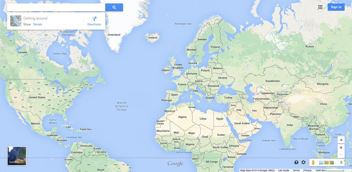
Figure 1a: Google Maps zoomed out to global scale
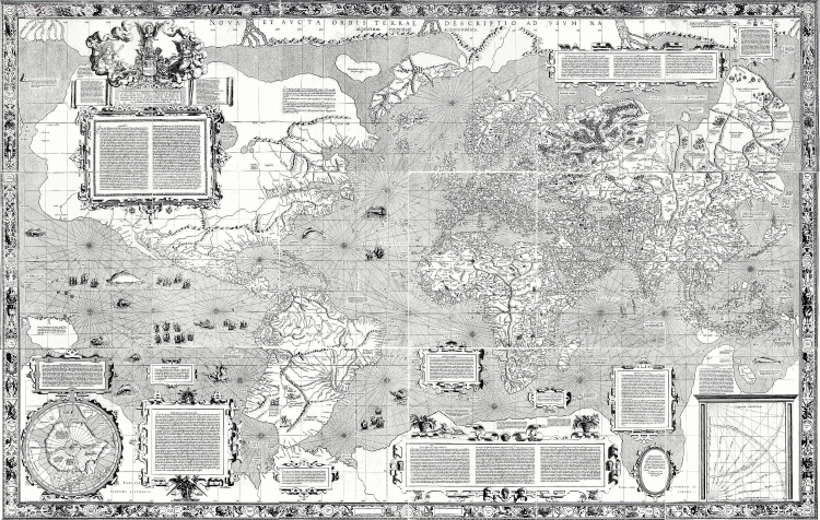
Figure 1b: Map of the world, Mercator 1569
Like all maps,
Google Maps are based on a selected datum
and use a
certain projection.
As you probably remember from your introductory GIS module, a map datum is a reference ellipsoid, which is assumed to be curved in a similar way to the Earth's surface. The Earth is not perfectly spherical – it is slightly flattened at the poles. However, neither is it a perfect ellipsoid: for different parts of the Earth's surface different ellipsoids will offer the closest match to the actual surface; for this reason different national mapping agencies will select differing datums as the base for their maps. The datum also offers a reference surface from which local surface elevations are measured. A datum that is a close match in one particular region may not be such a good match elsewhere in the world. However, a number of datums exist that provide relatively good coverage across the whole of the globe. Google Maps is (now) a global data collection, and thus a global level datum is required. The datum used is based on WGS84 (World Geodetic System 1984); this datum is widely used, including being the datum used by the Global Positioning System (GPS).
A map projection is a method used to draw the curved surface of the Earth (or, data collected using a co-ordinate system based on a selected datum) on (usually) a flat plane. There are three main groups of projections: planar, conic and cylindrical, which each have there own merits and their own disadvantages, and offer greater or lesser distortion in terms of factors such as area, shape, direction and scale. As with a choice of datum, if one is interested only in one particular country or region, then there may be projections that offer little distortion for the area in question. However, for a global map, a choice of projection will require some aspects to become highly distorted. The projection used by Google Maps is a Mercator projection, as illustrated in Figure 1, which shows a map from Google zoomed out to global scale (Fig 1a) and Mercator's 1569 map of the world (Fig 1b). The Mercator projection - developed in the 16th Century offers correct bearings at all points, and thus became very widely used for nautical purposes, and subsequently widely used for many other purposes. The Mercator projection's flaw are well recognised. It suffers from distortions of size with increasing latitude; thus for example Greenland appears to be much larger than it actually is when compared to other countries closer to the equator.
Below are a few of the links that we looked at in Principles of GIS if you want a reminder:
[ Next: Google Maps display modes and further features ]
[Course Index]