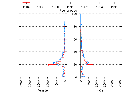
Source: NHSCR data
Notes
Red line indicates outflow from Leeds to rest of UK.
Blue line indicates inflow to Leeds from rest of UK.
Figures are for persons per single completed year of age.
The highest age group is marked here as '100'. It is, in fact, '100+'.
The animation cycles continuously.