Stan Openshaw and Seraphim Alvanides
Centre for Computational Geography
School of Geography
University of Leeds
Leeds LS2 9JT, U.K.
1. Introduction
Geographers have been slow to appreciate the importance of spatial representation in their attempts to describe and visualise patterns in socio-economic data. The map is a wonderful basic data visualisation device. Computer mapping packages and more recently GIS has greatly increased its popularity, but the socio-economic maps we have today are in essence little different from those that could have been drawn by hand, 50 years ago. Map design has changed only a little. The map parameters that can be tuned to modify the visualisation are essentially the traditional ones: class intervals, choice of symbolism, nature of representation (viz. choropleth, point, surface), and scale of the display. All of this is now highly automated and computer mapping in a world of GIS is today extremely easy. The problem is that there have been very few attempts to exploit the capabilities of the technology as a modern visualisation tool. The development of a GIS based human cartography has been neglected. The principal exceptions is the work by Dorling (1995) and the increasing use of simple computer map animation as a display and analysis device (Dorling and Openshaw, 1992; Openshaw et al., 1994).
The most fundamental problem with all cartographic based displays of spatial information is the strong (if not complete) dependency of the results on the nature of the spatial data and the inherent coding, spatial distortion, and generalisation filters that are unavoidably involved. Dorling (1995) explains part of the problem as follows: "Imagine that in your town or village a symbol is painted on every roof top showing the ages, occupations, wealth and political opinions of the people who lived in each home, and that you were given a detailed aerial photograph of the area. It would not take long to see where the most and least affluent areas are and what the people living there tended to do and how they vote... If, however, you were interested in the whole country or rather than just part of a town, this method would no longer work. The roof signs would not longer be visible... a more subtle picture needs to be created, a picture which is not necessarily directly related to the physical geography of the country" (p.xiv). The question is really what should this picture show and how should it be designed?
This problem is least serious when there is a close correspondence between the display and storage of the data; for example surface representations of continuous data; although this still ignores problems such as how to deal with generalisation and noise effects. In general with surface data displayed as a surface, what you see is more or less broadly similar to what exists. Change the resolution and the surface changes in a smooth manner without to many major surprises. The problem is greatest when the data relate to discrete zones as, indeed, most socio-economic data do. What you now see is a conflated mixture of zone design, scale, aggregation, and data effects. The nature of the zones used to represent the data now strongly influences the spatial visualisation. What you see now partly depends on the underlying microdata (prior to aggregation to the display's zoning system) and partly on the nature of the output zoning system; as well as cartographic design aspects (class intervals, colour, and symbolism). If the data and the cartography are held constant, there is still almost an infinity of alternative maps that could be generated, many of which could probably be declared to be substantially different in the displays and stories they tell.
This problem is another instance of the modifiable areal unit problem (MAUP); see Openshaw and Taylor (1979), Openshaw (1976, 1984). It has recently been rediscovered as a significant artefact affecting statistical modelling (Fotheringham and Wong, 1991; Fotheringham et al., 1995), although some still dispute whether it exists or can be made to go away (Arbia , 1989). The MAUP is unfortunately endemic to all spatially aggregated data and will affect all analysis and modelling methods that are sensitive to spatial data, only the poorest methods have any chance of being exempt! However, the MAUP also affects cartographic displays. The effects of scale (or size of zones) on the nature of the mappings that are produced is well known. Unfortunately there has been a tendency to view this as either a generalisation issue or as something that does not make much difference. As you increase the scale you lose detail and see less. However, the MAUP is mainly driven by the aggregation process and this factor tends to be conveniently overlooked. Maybe an example will help. Imagine a data set consisting of 1000 fine zones. If you map this data then there are 999 different changes of scale (and resolution) you could map, provided you assume that there is only one aggregation to each scale. This is the usual assumption, especially when hierarchically organised census or administrative areas data are being processed. In fact if the 1000 zones were UK census enumeration districts then you could map them as 1000 EDs, as 60 or 50 wards, perhaps 2 districts. However, if you relax this assumption of their being only one fixed aggregation to each scale, then you can begin to appreciate the enormity of the problem. For instance, there are about 101240 different 10 zone aggregations of the 1000 small zones! Which one do you use? It surely does matter! Currently this very significant source of any variation is ignored because of the absence of methods in existing GIS packages that are able to handle it.
Once it mattered much less because the users had no real choice, they were constrained to use a small number of fixed zone based aggregations. GIS removes this restriction and as the provision of digital map data improves we now have access to the full range of alternative zoning systems. The problem is that the same microdata can be given a very large number of broadly equivalent but different spatial representations. As a consequence, it is no longer possible to "trust" any display of zone based spatially aggregated data. There is nothing objective about a map display! The zoning system represents a major uncontrolled source of variation in the cartographic display that can easily interact with other map design parameters; e.g. class intervals, colour and scale and the patterns and relationships in the data to produce all manner of potentially weird effects. If any progress is to be made then it is important that this very significant source of variation is brought under control.
Suddenly users have to start seriously worrying about the nature of the spatial representation they use to visualise geographic information. It is argued that this problem mainly affects socio-economic information where because of confidentiality constraints and lingering data restrictions, attention is very often limited to the display and analysis of data that has been spatially aggregated one or more times. Openshaw (1996) explains the dilemma as follows: "Unfortunately, allowing users to choose their own zonal representations, a task that GIS trivialises, merely emphasises the importance of the MAUP. The user modifiable areal unit problem (UMAUP) has many more degrees of freedom than the classical MAUP and thus an even greater propensity to generate an even wider range of results than before" (p.68). The challenge is to discover how to turn this seemingly impossible problem into a useful tool for geographical analysis.
There are three possible solutions: avoid any re-aggregation of data, to explicitly engineer subsequent re-aggregations, and to use frame free methods or continuous surface representations. The latter option is not discussed on the grounds that an essential characteristic of socio-economic data is that are by their nature not frame-free nor sensibly converted into surfaces. The first option is briefly reviewed in section 2, and the second is examined in more detail in section 3. Section 4 gives a number of empirical illustrations to demonstrate some of the benefits of the new approach and its implications for GIS are discussed in section 5.
2. Avoiding re-aggregation
It is fairly obvious that the problem of not knowing which aggregation to use can be avoided by studying data at the finest level of spatial resolution. Dorling (1991) is one of the first to realise that modern visual display and plotting technology can in fact show unprecedented levels of detail. On a laser printer with 800 dpi resolution you could theoretically show on an A4 page the location of every household address in the UK to an accuracy of about 100m if you wished; or even a list of all the ward names in England and Wales. Some of these map displays are truly magnificent as artistic wonders and would even make superb calendars! There is still a degree of generalisation being provided but this is now mainly of a natural kind; viz. that which occurs when you simply cannot see all the detail (Li and Openshaw, 1992). However as geographic analysis tools this "show all" approach has much less value. Indeed the novelty of seeing everything soon wears off! Rather more than this is expected. Map generalisation at some higher degree of abstraction is useful. Spatial aggregation serves a useful generalisation and pattern detection purpose, provided it can be controlled in some way and converted into a focused tool.
If zonal data that cannot sensibly be displayed as points then another cartographic possibility is the cartogram. Dorling (1995) has demonstrated how useful this long neglected tool can be, once a good algorithm was developed. A cartogram is a distortion of a zoning system so that equal areas of the map are used to represent equal numbers of people (or some other variable of interest). Instead of seeing map distributions that reflect the physical land area of the data polygons, the size of the polygons are adjusted to reflect the quantity of a variable of interest located there. Dorling's principal contribution was to demonstrate in a very colourful way how cartographic visualisation could be used to support stories about socio-economic conditions in the UK.
The basic Dorling algorithm may be defined as follows:
step 1 obtain some data at some detailed geographic scale
step 2 map using a fine set of zones that constitute a population cartogram for some small but arbitrary areal units
step 3 using various colourful symbolism use the map to support a story about life and times in the study region of interest.
It is a nice idea to correct the distortions effect that polygon size (i.e. area) has on cartographic displays of variables for which area size is not a relevant factor. Why should a large but empty area grab your attention compared with much smaller but heavily populated areas that can hardly be seen due to their small physical size. It is surely only a matter of time before all GIS offer cartogram mapping capabilities. However, there are a number of weaknesses that still need to be addressed:
(1) there needs to be many rather than a single equal population cartogram;
(2) there are MAUP effects present in the base data;
(3) there is no attempt to use scale as a generalisation tool; Dorling's cartogram is based on the finest available data (wards in the UK) and are dependent on the number and average size of these base areas;
(4) it is still a "show everything as is" technology but what is shown is in fact grossly distorted by the cartogram transformation; and
(5) it is based on the Tufte (1990) assumption that "..the human eye and brain excel in their ability to see patterns, and the more detailed a picture is, the more visible is the pattern" (p.xv), however, this works best when the patterns are simple.
Dorling (1995) argues that " if some discernible pattern is seen on a ward cartogram, it is very unlikely to have arisen out of chance, and there is almost certainly an explanation for it and a process behind it" (p.xv).
There is no argument that cartograms are not potentially useful, merely a complaint that something much more powerful than this is needed to resolve the problems of socio-economic data representation in GIS. The cartogramic distortion of map space is a useful notion but it needs to be combined with some appreciation of the UMAUP. As the spatial resolution of the finest areal units continues to diminish then the need to combine the two continues to increase.
3. Re-aggregation as a deliberate design tool
The only alternative to "as is" spatial representation is to develop zone design as a spatial engineering tool to provide a platform for controlled visualisation and visual spatial analysis. GIS provides the user with the flexibility to design their own zoning systems based on their own re-aggregations of the available spatial data.
The basic questions are:
(1) does aggregation really matter;
(2) if it does, then how to do the re-engineering efficiently;
(3) the choice of zone design criteria is critical; and
(4) how to use zone design as a geographic data display and analysis tool.
3.1 MAUP effects
It is very easy to demonstrate the effects of using modifiable areal units. The problem arises in two ways:
(1) individual spatial point data relating to non-modifiable entities are aggregated to a zoning system; and
(2) already spatially aggregated data are re-aggregated one or more times.
The former is often beyond the users' control. In both cases aggregation is seen as being beneficial as it reduces the volume of data, it protects the confidentiality of personal data, and it creates geographical patterns. The problems arise because it also changes the data, it can alter measurement scales, it loses information, it generalises, it adds noise, and fundamentally changes the entities (or objects) that are available for subsequent study. In a human geographic context, data about people becomes data about spatial objects such as places, zones, etc. With zonal entities there is a strong implicitly assumption that they are comparable objectives (i.e. zone 27 can be compared with zone 59 because they are both zones), but in fact (from a socio-economic perspective based on the nature of the containing areas) they need not be comparable entities at all. For example, zone 27 could represent a rural village whilst zone 59 is part of an urban housing estate. This 'chalk and cheese' problem can occur even in the most finely zoned census data (Openshaw, 1996).
One solution is to explicitly design zonal objects as meaningful entities related to a particular purpose. The best example is that of local labour markets (Coombes et al., 1986). Here the re-aggregation is still arbitrary but the resulting zones are declared to have an explicit validity of a substantive kind relevant to one type of study at a particular spatial scale. The problem is deciding what sorts of areal objects might be most useful for studying disease or housing characteristics, or even unemployment rates. The problem with designing set piece regionalisations is that there are, in theory, an infinite number of them. There is currently a regrettable tendency to use the few that exist for virtually any and every data set that is available in an unthinking way (e.g. Champion, 1989). This was more acceptable when zone design was hard and a lengthy process; it is much less relevant when the technology exists to permit as a matter of course almost continuous redefinition that is tuned to a particular application.
3.2 Why might re-aggregation be useful?
In essence all spatially aggregated data has been damaged by being spatially aggregated. It is further damaged by the potential that exists for endless re-aggregation. The question is, therefore, under what circumstances can controlled or purposeful spatial aggregation actually help? The answers include:
(1) if it can improve consistency of spatial representation by aggregating out the anomalous areas and reducing spatially lumpiness;
(2) if it can help display hidden geographic patterns by removing or reducing aggregational distortion whilst amplifying interesting patterns;
(3) if it can improve the quality of the data by removing small number and unreliable data effects;
(4) if it can be used as a visualisation tool able to graphically represent the data in particular purposeful and new ways;
(5) if it can help simplify subsequent analysis and modelling tasks by removing those aspects of spatial data that cause the greatest statistical problems; and
(6) if it can help as a visual spatial analysis tool.
3.3 Zone design as a visual geographic analysis tool
It is argued elsewhere that far from being an insuperable problem the modifiable nature of zonal data offers the geographer an immensely flexible and powerful visualisation and analysis tool (Openshaw, 1996). The zoning system can be viewed as a pattern detector that can be visualised (because it can be mapped) and which provides a visual representation of the interaction between the spatial data being re-aggregated and the function (and/or, constraints) being optimised by the aggregation process. The hope was expressed that viewing the zoning system created by the aggregation process might itself have some interest as a visual geographical analysis tool (Openshaw, 1984b). However, this needed the development of GIS to reach a minimal level of maturity and the availability of fine zone digitally encoded zonal data sets before these dreams can become a practical reality. It also needs both a major shift in attitudes (Openshaw, 1996) and the development of practicable zone design algorithms (Openshaw and Rao, 1995; Openshaw and Schmidt, 1996).
An Arc/Info based Zone DEsign System (ZDES) has been developed (Openshaw and Rao, 1995; Alvanides, 1995) that seeks to routinise zone design and offers a number of generic zone design functions. The remainder of this paper presents some empirical examples of ZDES being used on 1991 census data for enumeration districts for parts of the UK. ZDES is designed as a portable add-on to Arc/Info and a beta test version (ZDES v.3.0 b) can be obtained from the Centre for Computational Geography, School of Geography, University of Leeds; see WWW http://www.geog.leeds.ac.uk/research/ccg.html for further details.
4. Empirical Examples
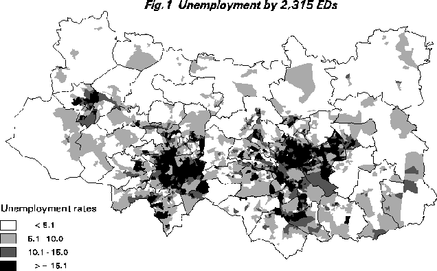
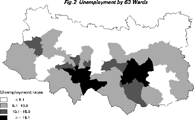
It is useful to consider a few illustrations of some of the issues that are being discussed here. Consider 1991 census data for the Leeds-Bradford area of the UK. The finest resolution census data are that provided for 2,315 small areas known as census Enumeration Districts (EDs). A typical ED would contain about 200 households. Consider a simple variable such as percentage unemployment (viz. percentage seeking work divided by economically active population). This variable is mapped using Arc/Info at the ED level (Figure 1). The same data are available for 63 wards (EDs nest into wards). Wards are the smallest official legally recognised spatial units in the UK. The result is shown in Figure 2. A much simplified picture is obtained with at least some of the high unemployment areas being "smoothed" out and thus removed by the aggregation process whilst other areas have seemingly been made more unemployed! This is due to the interaction between the class intervals and the aggregation process. Aggregation is essentially an averaging down process but the effects are not spatially consistent.
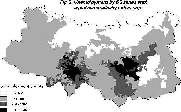
There is another problem with spatial data that is often overlooked. The precision of the data is not constant. Whilst the accuracy of the census is more or less uniform, the levels of precision in the cartographic displays is very variable and reflects the size of the zone denominators. A 15% unemployment rate for an area with 10,000 economically active persons is much more precise that a 15% rate for an area with a denominator of only 100 persons. Likewise there are other small number effects that may matter; for instance it is much easier to obtain an extreme result in an area with a small denominator than a large one. Bayesian mapping methods attempt to handle this problem but often generate other difficulties; for example, the proper specification of the prior distribution. A much simpler geographical solution is to aggregate the 2,315 EDs to create 63 zones of approximately equal economically active population size. The map of unemployment now has the effects of zone size and varying data precision removed. There is still however the assumption that 63 ward-like areas is a sensible scale for studying unemployment in this region.
Figure 3 shows a much improved representation of unemployment patterns. Some areas have lost unemployment, whilst one or two new black spots have appeared that previously had been averaged out in both the ward and ed. level maps. Additionally the data can now be displayed as counts, since the base areas are of almost identical size (about 8,700 economically active persons). Consequently, the 5.1% category roughly translates to less than 451 unemployed, the 5.1-10.0% to 451-900, the 10.1-15% to 901-1351, and the over 15% as above 1351 unemployed persons. This could also be shown as a density surface.
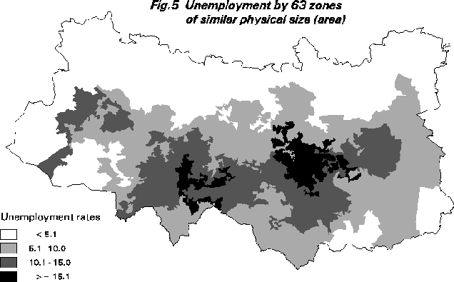
Other zone design functions that may be of interest are cartograms and equal physical size zonations. The cartogram function seeks an aggregation of the data such that physical size of the zones matches the size of economically active population. Unemployment rates are then displayed against this base. As Figure 4 shows the result is in this instance not helpful. Maybe more zones might be better. Similarly, there is no reason why the 63 output zones cannot be re-engineered to have a similar physical size without regard to the population living there (if grid-squares). As Figure 5 shows these results are interesting but not particularly useful.
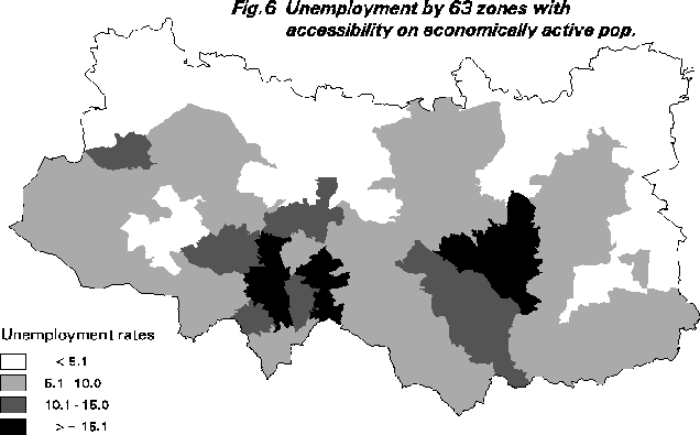
Another experiment with the Leeds-Bradford unemployment data concerns what happens if an attempt is made to split up the area into regions of maximum accessibility to unemployed people. This is a kind of location-allocation problem except that here the aggregation process is being used to optimise both the placement and membership of these maximal accessibility regions. The hope is that viewing the results will provide some further insights into the patterns of unemployment. Small regions indicating a dense, closely knit cluster of unemployed; whilst larger ones indicate a more spread out pattern; see Figure 6. Different exponents on the distance function might further help clarify the patterns and this is currently being investigated.
A final illustration involves the use of a constrained zone design process. So far all the zoning systems have been unconstrained; other than the constraints inherent in the zone design process (viz. coverage and internal contiguity). This can produce extremely unusual zones. There are arguments that this does not matter, either because the shape of the zones are informative about the interactions between data and zone design functions, or because the aesthetics of zones is a totally undeveloped field, or because there is already a de factor practice of using peculiarly shaped zones for example in electoral re-districting (Monmonier, 1995). However, some applications of zone design do involve optimising some function subject to additional constraints on the zonal data being produced. This type of application will become much more prevalent as attempts are made to use zone design as a spatial analysis and modelling tool.
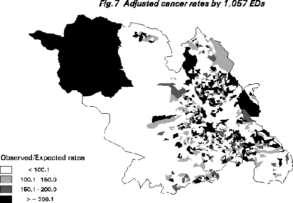
Consider the task of detecting clustering in disease data for a particular cancer in Sheffield. The available data can be aggregated to 1,057 census EDs and mapped. Figure 7 shows these age-sex adjusted O/E rates; values of 100 are average. Note the large apparent "cluster" of high values in the top left of the map. Spatial epidemiology is extremely difficult; there are extreme small number problems, considerable noise due to latency, and a almost complete lack of prior knowledge about where to look or what to look for.
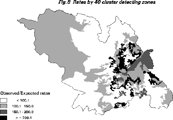
One possible exploratory approach is to seek a zoning system that maximises the variance of (O/E) subject to having zones with similar numbers of expected cases. This standardises for geographical unevenness in populations at risk, removes small number effects, and permits maximum flexibility for multiple high and low cancer regions to emerge. Figure 8 provides some results for a 40 zone aggregation. Note how quite different patterns are produced. Seemingly this method has some potential as geoGRAPHICAL tool.
5. Conclusions
The widespread adoption of fixed sets of boundaries used in all kinds of spatial modelling, analysis and representation of data can be considered a form of "mapism"; Monmonier (1995) explains this phenomenon as follows "to describe the illfounded but unshakeable belief that a specific world-map projection is vastly superior to all others" (p.3). The equivalent of a map projection in socio-econimic spatial representation could be a zone aggregation, but the distortion of reality by the MAUP in the later is not as yet known. Yet, geographers experience "zonism" every time they have to analyse data provided for different official zoning systems. Apparently, the task of converting and merging different datasets is left to the individuals; but changing zoning systems is as hard as changing map projections but completely without any transformation formulas. The exercise is even more difficult when socio-economic data is used, since the distorted patterns are almost impossible to be revealed by mere observation of the study area. Additionally, there is no real knowledge of what the "true" result is; only a glowing awareness of how easy it is to lie with maps.
What we argue here is a new way of aggregating, modelling, analysing, displaying spatial socio-economic data. This is important because most of the cartographic, mapping and GIS advances of spatial representation during the last two decades have neglected the special needs imposed by this sort of data. It is aparent from this study that the range of different representations of the same dataset is only limited by the imagination of the user. Attention is drawn here to the possible misuse of zone design as a geographical representation tool; it can be used by the naive user to further discredit spatial data. Analysing data for virtually any zoning system without any concern about the nature and limitations of the units being studied, inevitably leads to zoning anarchy (Openshaw and Rao, 1995). The way forward is to identify suitable zone-design functions and constraints, best for particular purposes and to be able to compare and evaluate alternative zonations of the same dataset. Zone design in a GIS environment should be as routinely applied as map design and this paper illustrates this argument.
Zone design is viewed as offering a flexible spatial analysis and visualisation tool. It is also a potentially important spatial data management tool. As the resolution of socio-economic databases continue to improve so it becomes important to consider the design of the very first spatial aggregations. Currently these are arbitrary and clumsily performed based on ad hoc rules designed to preserve confidentiality, but without any clear notion of what that means. Ideally it is a zone design problem with confidentiality risk constraints on a minimum zone size constraint, and a desire to optimise the loss of information.
Zone design is essentially a problem in socio-economic GIS. Previously it has been largely ignored. It is a critical and most significant problem and technology designed to aid its resolution needs to be as widely diffused as possible, emphasising the positive rather than the negative aspects. The challenge now is threefold:
(1) to raise inner awareness of what is now possible;
(2) to demonstrate utility in the widest possible set of applications; and
(3) to improve access to zone design technologies - in the broadest range of GIS.
Hopefully this paper will contribute to this process.
References
Alvanides, S., 1995, The investigation of a Zone Design System for reconstructing census geographies Dissertation 3031, School of Geography, University of Leeds
Arbia, G., 1989, Spatial data configuration in statistical analysis of regional economic and related problems Dordrecht, Netherlands, Kluwer
Champion, A G., 1989, Counterurbanisation: the changing pace and nature of population decentralisation Arnold, London
Coombes, M G., Green, A E., Openshaw, S., 1986, An efficient algorithm to generate official statistical reporting areas: the case of the 1984 Travel-to-Work Areas revision in Britain. Journal Operational Research Society 10: 943-53
Dorling, D., 1991, The visualisation of spatial social structure PhD thesis, University of Newcastle upon Tyne
Dorling, D., 1992, Visualising people in space and time. Environment and Planning B 19: 613-637
Dorling, D., 1995, A new social atlas of Britain Wiley, Chichester
Dorling, D., Openshaw, S., 1992, Using computer animation to visualise space-time patterns. Environment and Planning B 19: 639-50
Fotheringham, A S., Wong, D W S., 1991, The modifiable areal unit problem in multivariate statistical analysis. Environment and Planning A 23: 1025-44
Fotheringham, A S., Densham, P J., Curtis, A., 1995, The zone definition problem in location-allocation modelling. Geographical Analysis 27: 60-77
Li, Z., Openshaw, S., 1992, Algorithms for automated line generalisation based on a natural principle of objective generalisation. International Journal of GIS 6:373-89
Monmonier, M., 1995, Drawing the Line: tales of maps and cartocontroversy, Henry Holt, New York
Openshaw, S., 1977, A geographical solution to scale and aggregation problems in region-building, partitioning and spatial modelling. Transactions of the Institute of British Geographers 2: 459-72
Openshaw, S., 1978a, An optimal zoning approach to the study of spatially aggregated data. In Masser I, Brown PJB (eds.) Spatial representation and spatial interaction. Boston MA, Martinus Nijhoff
Openshaw, S., 1978b, An empirical study of some zone design criteria. Environment and Planning A 10: 781-94
Openshaw, S., 1984a, Ecological fallacies and the analysis of area census data. Environment and Planning A 16: 17-31
Openshaw, S., 1984b, The modifiable areal unit problem. Concepts and Techniques in Modern Geography 38. Norwich, UK GeoBooks
Openshaw, S., 1996, Developing GIS relevant zone based spatial analysis methods. In Longley P, Batty M (eds.) Spatial Analysis: Modelling in a GIS Environment GeoInformation International, Cambridge
Openshaw, S., Rao, L., 1995, Algorithms for re-engineering 1991 census geography. Environment and Planning A 27: 425-46
Openshaw, S., Schmidt, J., 1996, Parallel simulated annealing and genetic algorithms for re-engineering zoning systems (forthcoming)
Openshaw, S., Waugh, D., Cross, A., 1994, Some ideas about the use of map animation as a spatial analysis tool. In Hernshaw HM, Unwin D (eds.) Visualisation in GIS Wiley and Sons
Tufte, E R., 1990, Envisioning Information Graphics Press: Cheshire, Connecticut