In this practical, we will use some open source GIS software to create a near
repeat map. This is a similar method to that used by the Police in cities like
Leeds and Manchester. The method itself is relatively simple, so any GIS software
should be able to create the map following similar procedures to those outlined
here. In this case, we will use QuatumGIS (QGIS) - an open source GIS
program that runs on numerous computer operating systems and is becoming very
popular and widely used.
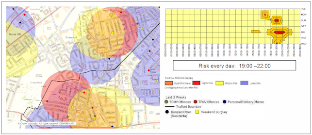
Trafford method at work, from Fielding and Jones, 2012b
Start by downloading the QGIS software from their website.
Once it has finished downloading, install and run the QGIS Desktop program.
A near repeat map can then be created as follows.
Loading the Data
We begin by loading the data into QGIS. We will use this file: robbery-randomised.csv, which
is an extended version of the file we used in the first half. Download this to a directory on your machine. The near repeat theory was developed largely
for burglary, so it is not clear how well it will work with crimes that involve mobile
victims. However, the process is the same for creating a map regardless of the type of
crime.
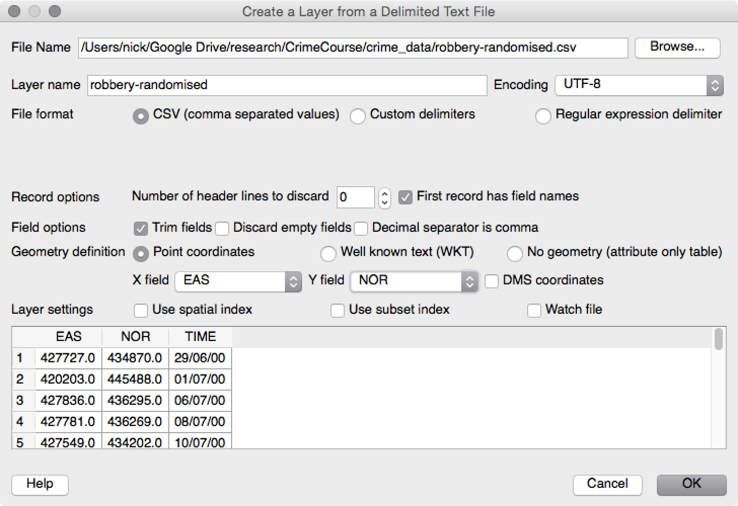
Begin by loading the robbery csv file (robbery-randomised.csv), as follows:
Click on Layer -> Add Layer -> Add Delimited Text Layer. This will open a window
similar to the figure below.
Loading a csv file in QGIS
Browse to the 'robbery-randomised.csv' data.
GQIS should be able to work out most of the options. You just need to specify the columns
that hold the x and y coordinates (the EAS and NOR columns respectively).
Click on OK, and then select the coordinate system. The robbery file stores coordinates
in OSGB 1936 / British National Grid. (If you type '27700' in the 'Filter'
box, it will find the projection for you.
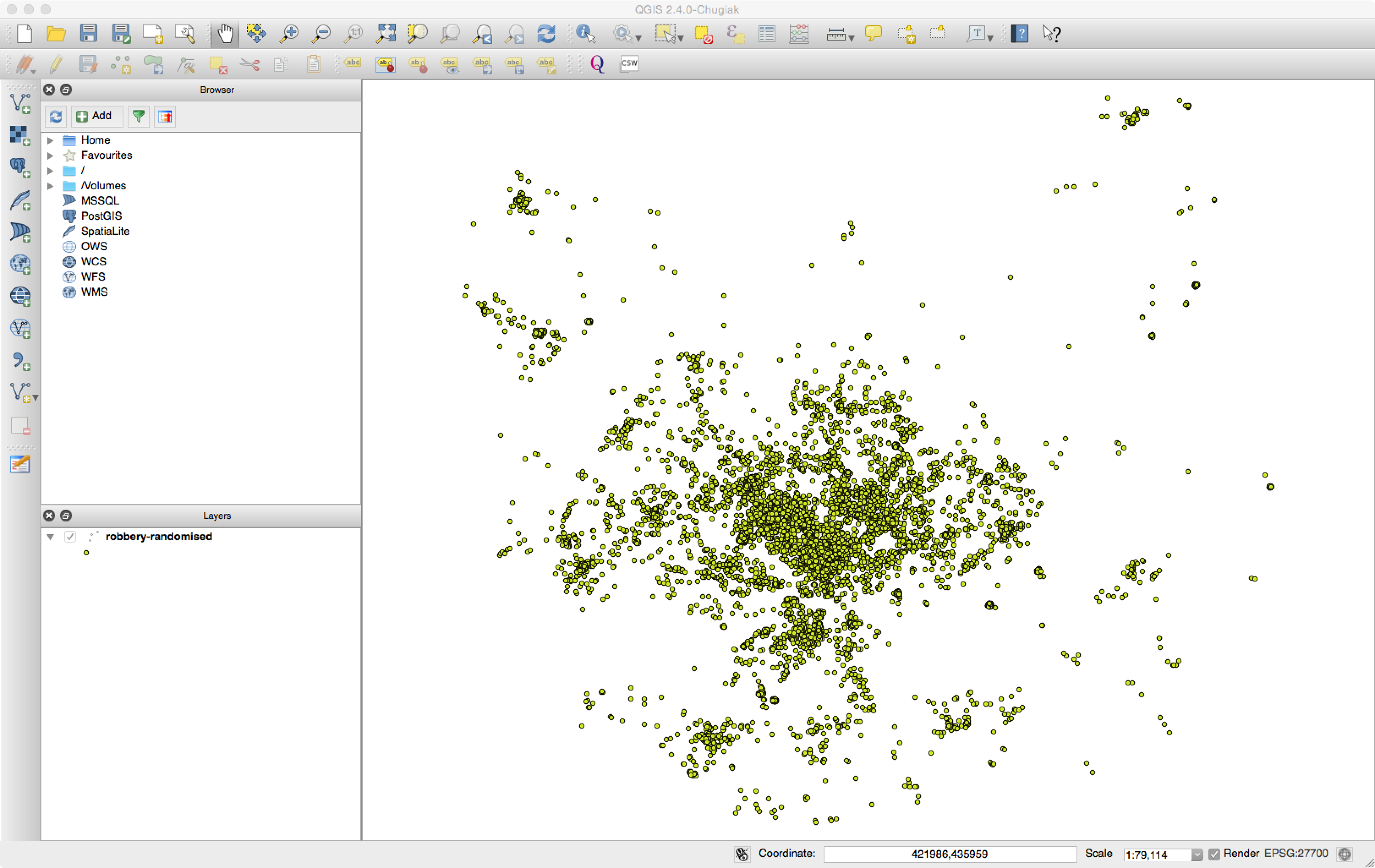
Click on OK again, and you should now see all the robbery data.
After loading the robbery data into QGIS
Selecting a three week time period
The method has been designed to predict the likelihood of a crime occurring in
the current week, given data from the three previous weeks. Therefore we need to select
data from a three week period only. We could have done this using Excel before loading
the data, but QGIS can do it as well.
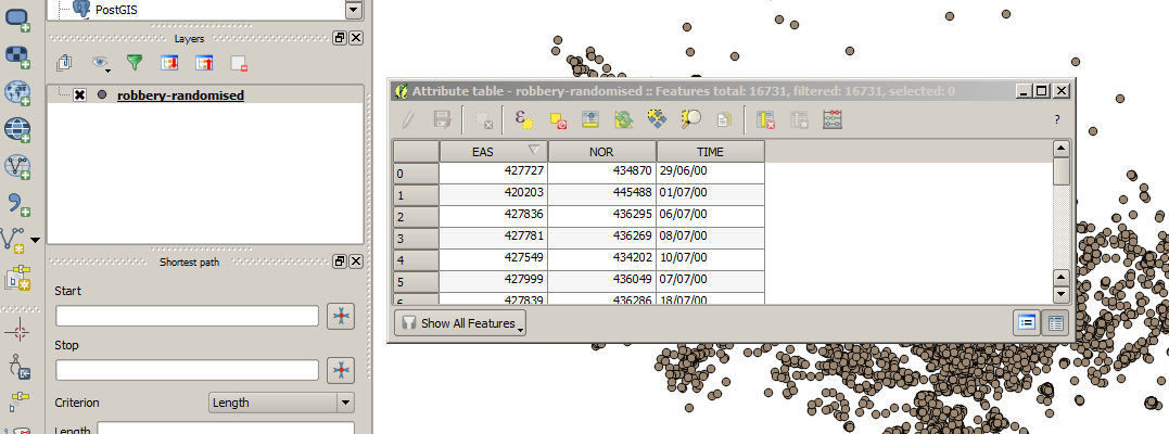
First we need to open the data table that shows the attributes associated with each
robbery. Look for the Layers window (usually somewhere on the left)
and right-click on the robbery-randomised layer. Then select
Open Attribute Table
The attribute table
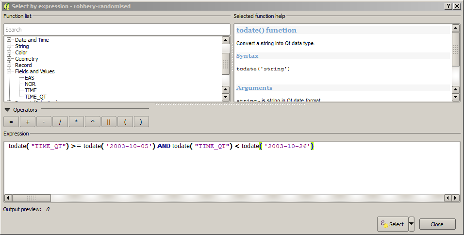
Then click on the Select features using an expression icon.
The new window can be used to create an expression to select features by. You
can either select fields and operations from the 'Function List', or just type in
the expression directly. Type the following to select all the data in a three particular
three week period (as this is just an example, the actual time period is irrelevant):
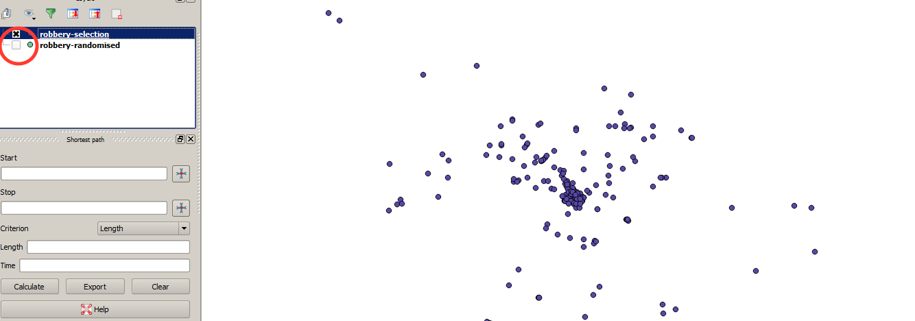
Now all that remains is to save the selection as a new layer. To do this, right-click on
the robbery-randomised layer again and choose Save As
Chose somewhere to save the file and give it a sensible name (e.g. robbery-sample).
Important: Tick the 'Save only selected features box,
otherwise the whole file will be saved, not just the selection.
After saving the selection, you should see a few more points added to the map in a different
colour. To simplify things, you can chose to stop displaying the original 'robbery-randomised'
points by turning them off in the layer window (on the left). See below.
The three-week selection of robbery data.
Creating the Near-Repeat Map
The final stage is to draw buffers around each of the points, and finally to colour the
buffers depending on the week that each crime occurred in. The radius of the buffers
determines the spatial scale at which you want to search for repeat crimes. In the
previous practical, we used the Near Repeat Calculator to
assist in deriving an appropriate spatial scale. That scale will be used here to set the size
of the buffers around each crime. If you cannot decide, or didn't run the last practical, 200m has produced good results in Leeds in the past, but this
is by no means the 'best' radius.
To create a buffer around each points, click on Vector -> Geoprocessing Tools ->
Buffer
In the new window, choose 20 segments (so that the buffers look like
real circles)
Choose the buffer distance that you decided on in the last practical, or 200m as suggested above.
A new file will be created, so provide a sensible name and folder to save it in
(I have called my file 'robbery-buffer').
Then press OK, choose British National Grid as the projection, and once
the buffers have been created click on Close.
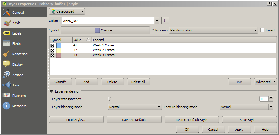
Finally, we just need to colour each buffer depending on the week in which the crime
occurred. Double-click on the robbery-buffer layer and then select the Style
tab. This is who we tell QGIS how we would like the layer to be displayed.
Click on the Single Symbol button (at the top of the window) and
change this to Categorised. This allows us to have a different style
for each point, depending on the week.
Under Column select WEEK_NO (this column stores
the week of the year in which the crime occurred).
Now, to add a new style for each week, do the following:
Press the Add button to create the first style.
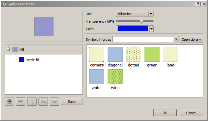
Double-click on the new style to bring up the Symbol Selector window (below)
The symbol selector window.
Change the Colour to blue, the Transparency to 66%,
and the press OK
Then, set 41 in the value column (see screenshot, below). This will apply the style to all
crimes that occurred in week 41, which is the first week we have data for.
Add some text for the legend, e.g. "Week 1 Crimes"
Repeat the above steps for weeks 42 and 43, using colours of yellow and red respectively.
Don't forget to set the transparency to 66% each time. After you have finished, you should
have something similar to the figure below.
The different styles for crimes in each week.
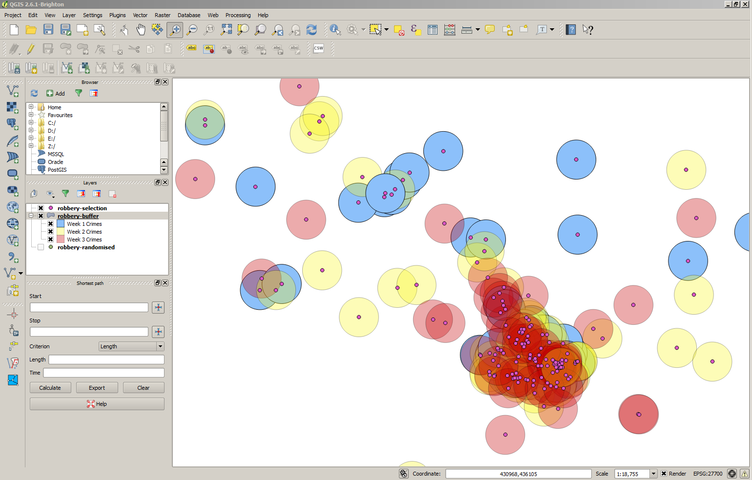
Finally click on OK and you should see something like the figure below (there are magnifying tools on the main toolbar if you want to zoom in).
The final near repeat map.
Those are all the steps required to create a near repeat map. The model suggests that the
places with the greatest crime risk are those where crimes have occurred in each week for
the past three weeks. As we set the layers to be be transparent, these areas will appear
Orange (blue + yellow + red = orange).
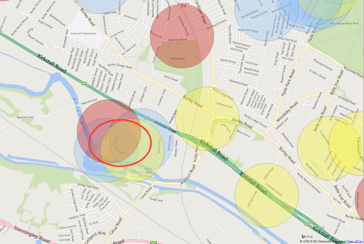
It is also possible to add a base map to the results, in order to see where in the city
the places with the greatest risk are. We won't cover base maps in this tutorial, but ask
one of us and we can show you how to add one. For example, in the map below, there is one area
in particular that appears to have seen crime evens in each week and, according to the
model, has the greatest risk of suffering another crime.
Identifying high-risk areas (Orange).
Finally, if you are feeling confident with QGIS, you might like to see one way of calculating the
crimes that would be detected by this method in comparison with crimes falling outside the buffers.
You can find this in PART THREE.